ABOUT T4
T4 is a popular boba tea franchise that has store locations all over the world. They are known for their handcrafted beverages brewed from real tea leaves and believe in the philosophy of connecting individuals with their motto "a cup of TEA FOR you."
ORIGINAL WEBSITE

The original website (left) was outdated and lacked personality. It failed to provide a list of the menu items which I believed to be essential for a restaurant website.


Additional problems that I noticed include an overloaded footer (left) and a news/events page that hasn't been updated in over two years.
STRATEGY
My goal for the redesign was to create a more user-friendly experience by simplifying most of the content while creating a visually pleasing product that enhances T4's brand personality and web presence. I started by listing the aspects that I believed could use some improvement as well as my solutions to those problems.
The Problems:
-
Outdated Website
-
No Menu
-
Lack of Updates with News/Events page
-
Cluttered Footer
-
Boring Contact Forms
-
Unresponsive Website
My Solutions:
-
Add more color to design, Parallax Features
-
Add Menu!
-
Remove News/Events page entirely
-
I didn't find a need to keep this if it wasn't going to be updated regularly
-
-
Simplified footer
-
Remove the about section & featured businesses
-
Remove "Latest Posts"
-
Simplify Mailing list form
-
-
Customized Contact Forms
-
Design a Responsive Website (mobile/web)
SITEMAP

I started by creating a sitemap to lay out the foundation of the website as well as list some possible features. I decided to use a monochromatic color scheme based off of the logo to help emphasize the brand.
WIREFRAMES


Menu (Web)

Stores (Web)
Home (Web)

Contact (Web)

Home (Mobile)
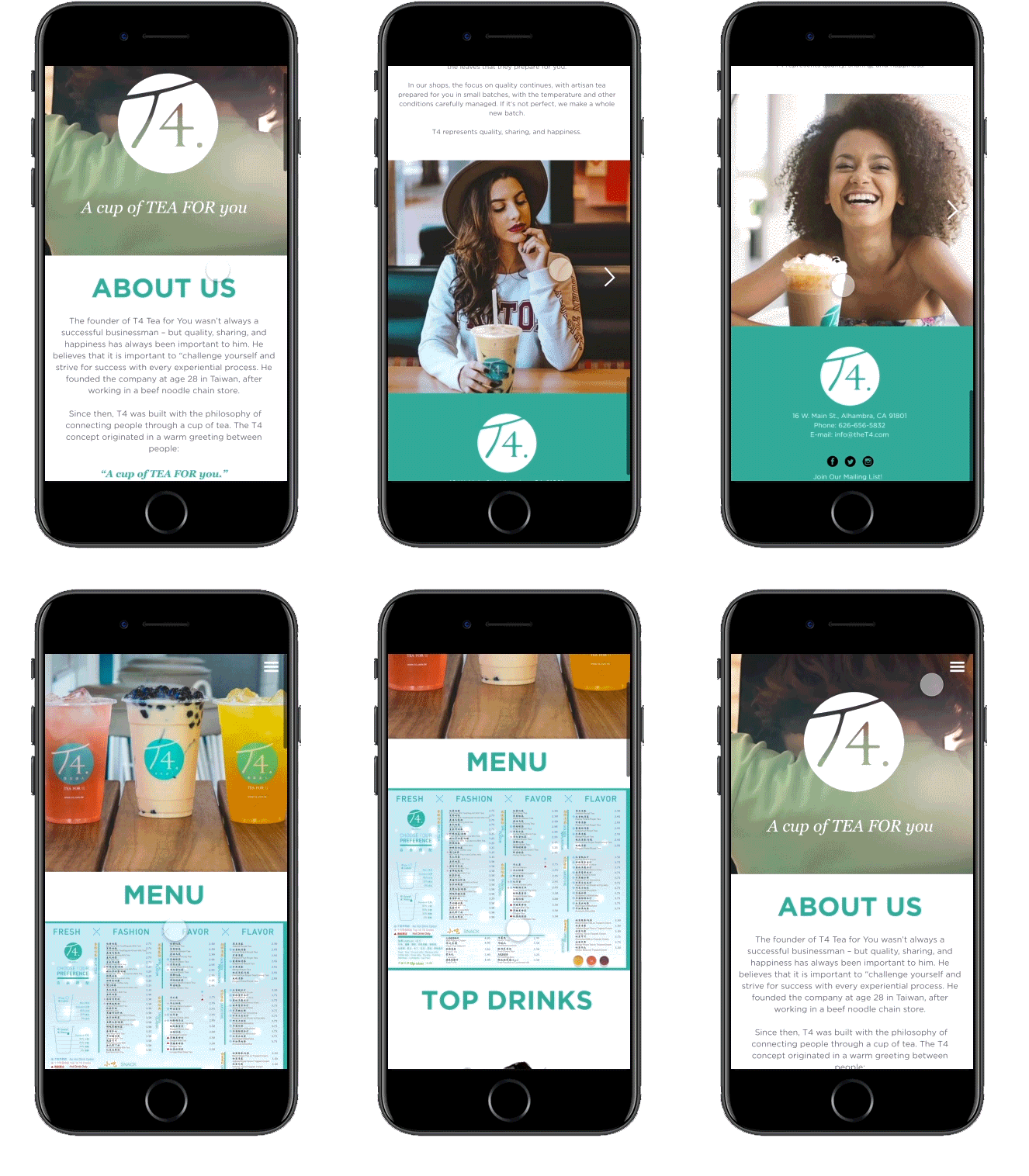
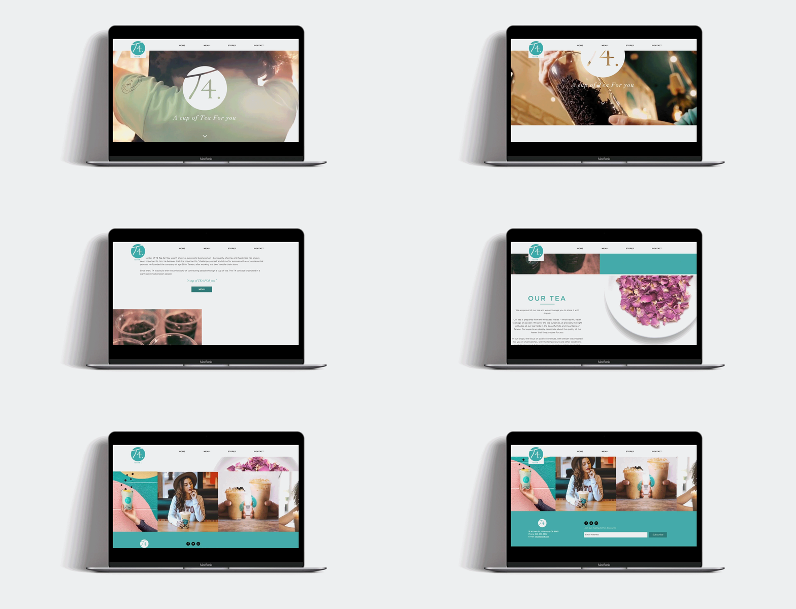
With Adobe XD I started to develop wireframes and mockups to come up with an overall design and produce a visualization of how the site would respond on a mobile device.
MOCKUPS & PROTOTYPES

Home (Web)

Contact (Web)

Menu (Web)


Stores (Web)

Prototype (Mobile)
Home (Mobile)

Prototype (Desktop)
After creating my prototypes, I began building the website using Wix.com. I found it to be really efficient as I was able to use their website builder as well as code. It also allowed me to provide a live demo of the website for free which you are able to see by clicking the link below!
TAKEAWAYS
Based on the problems that I initially found on the original website, my redesigned proved to be successful. I was able to create a user-friendly website by simplifying various aspects of the original site as well as enhancing T4's internet presence as a brand.
I learned a lot while working on this project especially when using Adobe XD. There was a lot of self-teaching involved as it's a relatively new program. One skill that I learned was how to create a carousel gallery animation in Adobe XD. This became useful when making the Instagram feature in my prototype be more engaging.
In future iterations, I would like to explore further on how to include the News & Events sections or even a Media page.


