PORTFOLIO DESIGN 2018 | VISIT WEBSITE
Webdesign, UI Design, Wix
CONCEPT
I wanted my first portfolio design to represent me in every way possible: bright, colorful, and love for 90's nostalgia. I took inspiration from my favorite beauty/lifestyle bloggers, make-up brands such as Colourpop, and Korean music videos.
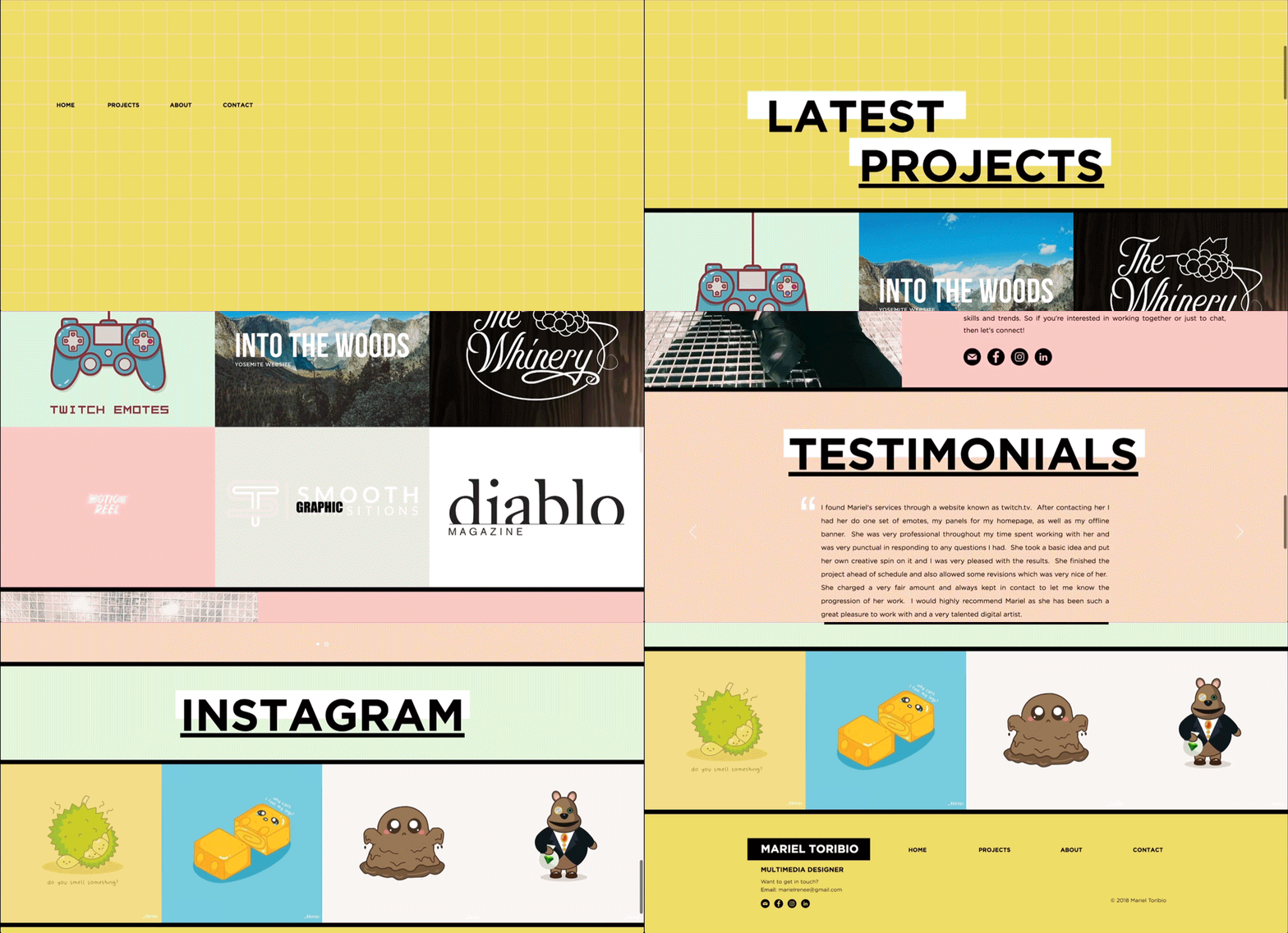
I started by creating a simple wireframe on Adobe XD to get a general idea of where and how I wanted to place everything. I decided to use a long scrolling webpage design because I wanted to minimize the need of having to go through multiple pages to find my information. The viewer would be able to learn more about me, my projects, and Instagram all on one page. Then using Wix, I developed a personal template for myself using their website builder and coding.


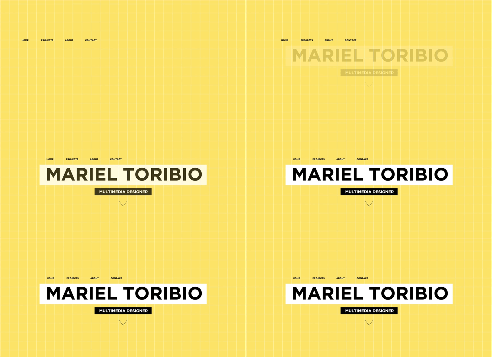
ANIMATED HOMEPAGE

FULL LONG SCROLLING WEBSITE


